27.08.18-18 (Week 1- Week)
Kang Jiet Yee (0336776)
Design Principles
Exercises and Projects
Lecture 1 : Module Briefing / Contrast
27.08.18 - 30.08.18 | Week 1
Lecture notes
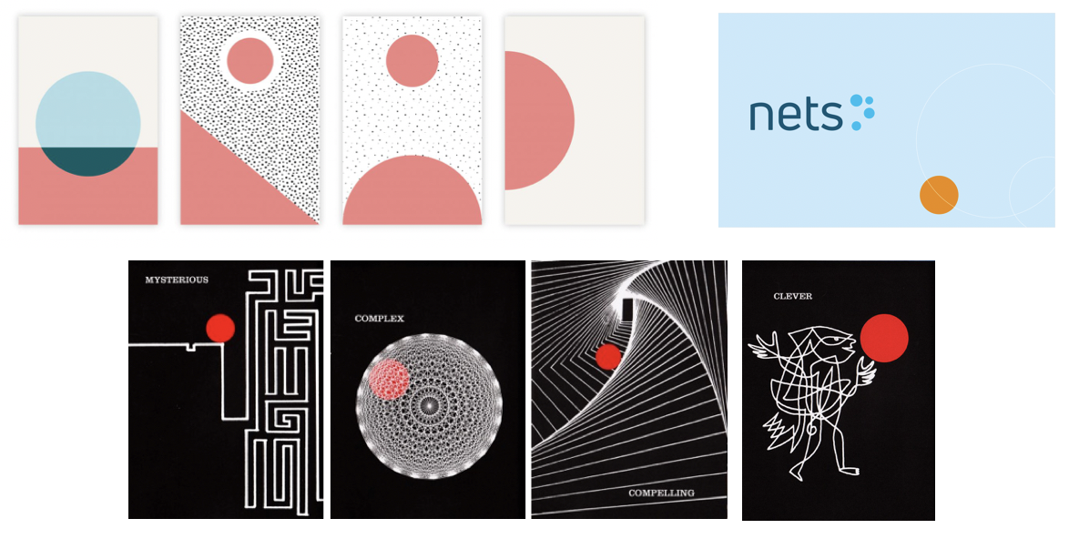
We started our lecture with a brief information of the module information booklet. Then we move on to talk about the first topic in design principles which is contrast. For better understanding, Ms. Sherry have also shown use a few examples of contrast to us.
- Contrast can be define as the arrangement of opposite elements (colours, textures, shapes and size etc.) together in order to create visual interest.
- Contrast happens when two or more visual elements in a composition are different.
- Contrast can be use to generate impact, highlight importance, create exciting graphics and create visual interest and dynamics.
 |
| Example of contrast |
 |
| Example of contrast |
 |
| Example of contrast |
Design Progress
We are assign to create a black and white piece that shows contrast
I come out with few different idea which combine of two different things that illustarte contrast.
 |
| Idea and Sketches for Contrast |
Then I finally decide to focus on cultural differences in food which can show contrast on people, since it was the first idea that pops out in my mind when I sketch about contrast. I choose to cut two different tableware to half and combine it to show the obvious contrast between asian and western culture in eating. For asian culture I choose sushi with a chopstick mainly because when people thinks about sushi, they will link to chopstick. Contrastingly, for Western food which is pasta require spoon and fork to eat, when western cuisine are mentioned, the first thing that came into my mind was be steak and pasta. I decided to work with pasta because I can play with contrast in between the space of fork.
 |
| Final Outcome : Contrast |
Feedback
I was getting some feedback from Ms. Sherry, I'm glad that she likes my work since she like spaghetti too, she mentioned that my angle as separate line looks like a table which also my first thoughts of creating this.
Lecture 2 : Gestalt
03.09.18 - 06.09.18 | Week 2
Lecture Notes
Gestalt is from a psychological term from perceptual organisation, which is the task of determining what edges and other stimuli go together to form an object.
- Proximity : The closer objects are one to another, the more like we are to perceive them as belonging together
- Similarity : We tend to perceive similar elements as part of a group
- Enclosure : Things that appear to have a boundary around them are perceived to be grouped, and therefore related.
- Closure : We tend to fill in missing contours to form a complete object
- Continuity: When sensations appear to create a continuous form, we tend to perceive them as belonging together
- Connection : When stimulus elements are connected by other elements, we tend to group them together
 |
| Examples for Gestalt |
- Figure and Ground (Reversible image) : Can be organised by your perceptual system in two ways (figure and ground)
 |
| Examples for Figure and Ground |
Design Progress
We are assign to create a gestalt by cut and pate the black and white paper.
I used my pet cockatiel as inspiration since I was browsing on google and saw few design using animal as gestalt.
After the second critique, I keep the design of the bird and combine it with a tree that shows more idea about gestalt.
 |
| My Pet Cockatiel |
 |
| Sketch of the cockatiel |
 |
| First attempt for gestalt |
 |
| Sketch after getting feedback |
 |
| Final Outcome of Gestalt |
Feedback
My first work for the gestalt was not so good, Ms Sherry advised me to apply more gestalt in it, then I choose to combine it with a three that show some gestalt in it. For the second critique, Ms Sherry mentioned that my gestalt are quite obvious which can be improve more. Then we need to quickly move on to the next exercise.
Lecture 3 : Symmetry | Asymmetry | Balance | Dominance
11.09.18 - 13.09.18 (Week 3)
Lecture Notes
From this week onwards, the lecture will be presented by our fellow classmates, the group that assigned for this lecture was very interesting, they have given fews examples that shows a clear idea for us to understand the principles. They was talking about four related design principles which is symmetry, asymmetry, balance and dominance.
- Symmetry: elements that arranged in the same way on both sides of an axis, mirrored over the axis and same on both sides.
 |
| Example of Reflectional Symmetry |
 |
| Example of Translational Symmetry |
 |
| Example Of Rotational Symmetry |
- Asymmetry: Different from symmetry, asymmetry is when the arrangement of elements are different on both sides of an axis.
 |
| Vintage Poster |
- Balance : The distribution of visual weight of objects, colours, texture and space in a composition.
 |
| The Great Wave off Kanagawa, Hokusai |
- Dominance: Refer as the on its greatest visual weight, the e4lemts that catch an eye more than anything else on the page.
 |
| Poolside, Mediterranean Gray Malin |
Design Progress
My first idea was popping out when I was driving home after class, there was a dream catcher in my car, which I can saw the symmetry in it. The second idea was about coffee, latte art that reminds me that one of my friend mentioned that I like symmetrical order stuff which illustrates well in simple latte art because he knew that I dislike the latte art that were not symmetrical (e.g swan art) which is the portion were not equal in both side. So I decided to combine the two ideas together which I insert the latter art into space of net in the dream catcher. Looks like it catches the latte art where not just a dream catcher nor a cup of coffee that shows reflectional symmetry.
For the background, I used soft blue and purple colour with light texture ,contratsingly for the latte art in the middle, I decided to put on more heavy and thick colour to show the richness of the coffee for the result of making the latte art looking outstanding and distinct from the background which related to the principle of dominance in it.
 |
| Visual Reference : Coffee |
 |
| Visual Reference : My Dream Catcher |
 |
| Sketch of Symmetry idea |
 |
| Final Outcome : Symmetry & Dominance |
Feedback
I am glad that Ms. Sherry like my work, it is symmetrical and she mentioned that the light background colour and the heavy colour paint of coffee show strong contrast which make the coffee more outstanding.
Lecture 4 : Pattern | Repetition | Texture | Surface
18.09.18 - 20.09.18 | Week 4
Lecture Notes
It was the turn for me and my group mates to present for this weeks topic
We was talking about pattern, repetition, texture, surface:
- Pattern : Repeating of any regularly repeated arrangement. There are 4 general types of pattern (Branching, Spiral, Flow, Packing and Cracking)
 |
| Example of Pattern |
- Repetition : Repeating a single elements may times in a design, by using similar (shapes, colours or line) or connected pictorial elements.
 |
| Example of Repetition |
- Texture : The quality of an object which we sense through touch, texture can also be illustrate in an image, suggested to the eye which can refer to our memories of surface we have touched.
 |
| Example of Bristly, rough, and hard Surface |
- Surface : Refers to the outermost or uppermost layer of a physical abject or space where any type of median is applied on.
 |
| Example of Surface (Wood) |
Design Progress
We are assign to use rubber stamp for this task, working on pattern.
The material I choose was potato stamp, with leave pattern, represent repetition of pattern in different colours. I bought few potatoes to work on, craft out few different patterns and and finally decided the pattern, I was planned to make the leaves all in green colour but the outcome was not so good, then I try out with 6 different colours which makes it not dull.
 |
| Material Used : Potatoes |
 |
| Design of Potato Stamps |
 |
| Potato Stamp |
 |
Final Outcome : Patterns and Repetition
|
Feedback
I am glad that Ms Sherry likes my work, she commented that the pattern shows repetition which is nice and show the principle in it. Besides, it would be better if I can play around with the patterns, it was not necessary to be all the same, it may also be rotate, it can also reach the edges.
Lecture 5: Alignment | Hierarchy | Placement | Direction
25.09.2018 - 27.09.2018 | Week 5
Lecture Notes
The lecture for this week is talking about alignment, hierarchy, placement and direction. It was an interesting topic which gain us a great experience to know about it.
- Alignment: The arrangement of visual element for lining up in a composition
Edge Alignment: Where arrangements of elements align to the edge of the page.
 |
| Edge Alignment Example |
Centre Alignment: Where elements are align to the centre
 |
| Centre Alignment Example |
Visual/Optical Alignment
 |
| Optical Alignment Example |
- Hierarchy: Refers to the arrangement or presentation of elements in a way that implies important
Scale: Large item that catches the viewer attention.
 |
| Example of Hierarchy: Scale |
Colour & Contrast: Using object that is different from surrounding to make it stands out.
 |
| Example of Hierarchy: Colour & Contrast |
White Space: Draws attention by setting the elements isolate to help it stands out.
 |
| Example of Hierarchy: White Space |
Proximity:
Nearness to an eye-catching element also affects visual hierarchy.
 |
| Example of Hierarchy : Proximity |
- Placement: The change and position of change or objects that can affect the visual depth and composition of an artwork.
 |
| Placement Example |
- Visual Direction: About leading the eye to the next location
Horizontal: The composition appear calm and stable
 |
| Visual Direction : Horizontal |
Vertical: A sense of formality, alertness and balance
 |
| Visual Direction : Vertical |
Diagonal: Suggest movement and action
 |
| Visual Direction : Diagonal |
Design Progress
The median we use for this exercise is collage, with is cutting and paste the elements on a blank paper. I was looking into an Ikea catalogue then I found a jar pouring yellow liquid was giving me some inspiration for collage which I keep on searching for yellow object looks like those objects were poured from the jar that shows Centre Alignment in the whole piece.
 |
| Progress of creating Collage |
 |
| Final Outcome : Collage |
Feedback
I am glad that Ms. Sherry likes my work, she commented that the white space are nice and the object shows like pouring down form a triangular shape which have a very nice composition =.
Lecture 6 : Dots | Line | Size | Scale
02.10.2018 - 04.10.2018 (Week 6)
Lecture Notes
This week lecture was talking about dots, line, size and scale. It was amazing to know that simple things can create such interesting artwork.
- Dots: The smallest and most basic element of graphic design, designing with dots can create a wide variety of visual effects. Also, there are various associations that can be made with positioning a single dot in different areas of a page. Dots can form complex shapes, patterns, textures, and any other structure imaginable.
 |
| Example of Dots in Graphic Design |
- Line : Straight line can use to create depth, 3D effects where using curve line, we can form texture, also some simple line art.
 |
| Examples of Straight Lines : Depth |
 |
| Example of Straight Lines : 3D effects |
 |
| Example of Curve Lines : Texture |
 |
| Example of Curve Lines : Simple Line Art |
- Size : How big or small an element is in relation to other object. Simply the relationship of the area occupied by one shape to that of another. Used to convey important, attract attention and create contrast by making a particular element stand out or give it importance.
 |
| Example of Size |
- Scale : Refers to the size of an object in relationship to another object. In art the size relationship between an object and the human body is significant. In experiencing the scale of an artwork we tend to compare its size to the size of our own bodies. It is similar to size, by compare sizes between elements which shows emphasis, drama, hierarchy and comparison (points out).
 |
| Example of Scale |
 |
| Example of Scale : Painting "Mark" |
Design Progress
The medium of this following exercise is mix media which we can use any used medium in our work, I choose to work with marker which I can define the line and dots in a more details manners.
I wanted to try out new things which I was not good at, so I decided to go with drawing hands, I was searching for two hand photography and I accidentally found my idea on a photography with hand reaching the shadow of other hand. I choose to use simple line on one hand and dots to do the shadows for the other hand, but I found the placement was to blank in a paper, then I decide to add some flowers into it to improve the composition of the whole piece. So I decided to browse on internet to search for some nice flower placement also the drawing sample of roses.
 |
| Visual Reference : Hand reaching shadow |
 |
| Visual Reference : Rose Composition |
 |
Visual Reference : Rose Sketch
|
 |
| Final Outcome : Dots and Lines |
For the shadow of hands and roses below, I used fine nib marker to create texture and patterns on it.
 |
| Close Up Details : Dots |
 |
| Close Up Details : Dots |
Feedback
Ms. Sherry commented that the composition was nice by putting roses in it, where shows some romantic in it. The placement was good and it was a well done work by putting effort in it.
Lecture 7 : Harmony | Movement | Rhythm
9.10.2018 - 11.10.2018 | Week 7
Lecture Notes
- Harmony: Can be described as sameness, the belonging of one thing with another.
Visual Harmony - unified by colour, shape, composition or some other visual design principle
 |
| Visual Harmony |
Conceptual Harmony - artwork has a common theme or concept throughout it.
 |
| Conceptual Harmony |
- Movement: path of the viewer’s eye takes through the work of art often to focus of areas. Such movements can be directed along lines, edges, shape and color within the work of art.
 |
| Movement : Anticipate |
 |
Movement : Multiple Image
|
- Rhythm indicates movement, created by the careful placement of repeated element in a work of art to cause a visual tempo or beat. There are 4 types of rhythms.
Regular rhythm - Occurs when the intervals between elements are similar in size or length. Basically its like repetition.
 |
| Regular Rythm |
Progressive rhythm - Occurs when there is a gradual increase or decrease in either size, number, colour, or some other quality of the elements is repeated.
 |
| Progressive Rhythm |
Alternating Rhythm- Occurs when there is two or more motifs that are creating an overall piece. Elements may not necessarily be identical to one another but it is similar
 |
| Alternating Rhythm |
Random Rhythm - Can created through similar elements or motifs that are repeated with no consistency, basically a random rhythm but in the end, the final piece could still be seen as a whole.
 |
| Random Ryhtym |
Design Progress
We are assign to take a photograph that describe the principles we have learnt in this week, which is harmony, movement or rhythm. Then I was exploring the principle, I found out a photo that shows harmony, which is the photograph that I took during my Malacca trip. It was a lot of rainbow colour umbrella which shows consistency and sameness which illustrates harmony well.
 |
| Final Outcome : Harmony |
Feedback
Ms Sherry says that the photograph do shows harmony in it, which is very nice, we are doing a good job. I'm glad that she likes my work. I also ask some feedback from my classmate, they agree with me which is the harmony has been illustrate well in it, and they like the colours and style of the photograph.
Lecture 8 : Shop & Form | Figure & Ground
16.10.2018 - 18.10.2018 | Week 8
Lecture Notes
This week lecture was taking about shapes, forms, figure and ground. The group who presented done a very good job and nice presentation slides were done.
Shapes are like the brains attempt at resolving
an object as recognizable to one’s experience.
Objects and environment that are recognizable to us
are referred as being Realistic / Naturalistic.
There are three main geometric shapes, which is square, circle and triangle, besides the main, we also have many others geometric shapes :
 |
| Example of Geometric Shapes |
 |
| Example of Artwork create using shapes |
Sometimes shapes can create an artwork, they may not be consistent and align, but it can be interesting too, which can shows in objective (Abstracted or derived from realistic objects.The source is not immediately apparent.) and non-objective abstract (Do not refer to any real objects.Based on pure study of form, line or color.) of shapes.
 |
| Example : Non-Objective Abstract |
 |
| Example : Non-Objective Abstract |
Form as an idea, indicating the characteristics of how we see something rather than how something is present as it is.Forms are also three - dimensional (3D). It gives dimension, volume, texture and space.Can be done by adding lines, tones or color.
 |
| Example : Forms (3D) |
 |
| Example for Other Forms (3D) - Outlines |
Figure and Ground : Figure represent the foreground and ground is the background. Figure and ground can be determined using blur, size and contrast, all with placement of the objects in an artwork.
Design Progress
The media I choose was water colour. I was planning to do shapes which illustrate by building in city also, foe the idea of foreground and background, I paint forest behind with blur texture, light colour night sky to create background which shows contrast using colours.
 |
| Visual Reference : Buildings |
 |
Visual Reference : Forest
|
 |
| Design Progress : Sketch & Water Colour |
 |
| Final Outcome : Figure and Ground |
Feedback
I am glad that Ms Sherry likes my work, she commented that this is a very well done job which I get it right to illustrate the foreground and background that shows organic and structure in it.
Lecture 9 :Proximity | Perspective | Proportion | Unity | Variety
23.10.2018 - .25.10.2018 9 | Week 9
Lecture Notes
Proximity
Grouping and shaping of objects in a composition.People will see objects that near each other are seem as a unit.
Perspective
Artists use perspective to represent three-dimensional objects on a two-dimensional surface in a way that looks natural and realistic.
Perspective can create an illusion of space and depth on a flat surface.
There are several different types of perspective depending on the number of vanishing points (the observers point where all the lines meet)
Proportion
The harmonious relationship between 2 or more elements that are put together in a composition so that all elements work together and no one element takes over and is too dominant, or is so small to be ineffectual.
Golden Ratio : The golden ratio is a mathematical method for determining proportion.
Good proportion adds harmony and symmetry, or balance, among the parts of a design as a whole.
Unity & Variety
Unity in an artwork creates a sense of harmony and wholeness, by using similar elements within the composition and placing them in a way that brings them all together.
Variety adds interest by using contrasting elements within the composition.
Design Progress
Plan to work on perspective
I took a photograph that I really like, which was the one I took of walking street in Malacca
 |
| Final Outcome : One Point Perspective |
Feedback
I am glad that Ms Sherry likes my work, she commented that the photograph was so nice and it looks modern which doesn't looks like Malacca Street, and clearly illustrate the principle of perspective.
Project 1 : Self-Portrait
11.10.2018 - 23.10.2018 (Week 7 - Week 9)
Instructions
Written Assignment - Southeast Asia Designer
This is the link for the Southeast Asia Designer file :
https://docs.google.com/document/d/1I8TbvGpXZQsuwOpWHdwLxKEFPCPFtnhkmcWrubeB9bs/edit?usp=sharing
Practical - Self Portrait (Design Progress)
I took reference from one of my photo, which have some sad feelings in it that fits my idea of doing my self portrait. The reason I choose a dark colour background is that represent my dark past and surroundings, contrastingly, the light pastel colour dress are my hope and dreams, kind of like wearing my dreams and hope that supports me walking through my dark past and surroundings. I was trying to show contrast using different colours to illustrate myself being trapped between my dream and the reality.
 |
Visual Reference : My own photo
|
 |
| Design Progress : Sketch |
 |
| Final Outcome : Self Portrait |
Feedback
I'm glad that Ms. Sherry likes my work, she mentioned that the only thing that could be done better is the background colour, the dress was stands out in the whole picture which is beautiful, besides, she states that I draw my face very nice and clearly shows that it was me in the picture.
Project 2 : Sense Of Place
- 30.10.2010 (Week 8 - Week 10)
Instruction
Design Progress
I am a person who like coffee and dessert, especially Japanese Soufflé Pancake, few months ago, one of my friend recommended me this cafe, which is neighbour's coffee bar, they serve very fluffy Soufflé pancake that become my favourite dessert right after I tastes it, then this cafe became my favourite cafe that near my place.
I always went there for good pancake also coffee, I took picture of their pancake everytime I visit there, and I choose to put it in my art piece since it's like the signature of their café.
After the we get introduced to this project, which is sense of place, I decided to work on this place since it meets the criteria where I often visit there different time in different day, and I love the atmosphere and design of the shop, it was very simple and clean place.
 |
| Photograph Used for Project 2 |
 |
| Photograph Used for Project 2 |
Then I went there again to take picture and try to abstract something from the space, I apply same colour filter and adjust the colour tone of my picture to make them more harmony to fit in together. Then I started to work it on photoshop, arrange my photograph, I try put the menu on top of whole image with lower opacity in order to blend the photograph together, the outcome turns out very nice and do show the sense I want from the place, a place that serve nice pancakes with different parts of the shop.
 |
| Final Outcome : Project 2 (Sense of place) |
Feedback
I'm glad that Ms.Sherry likes my works, she commented that my work are being doing in a very nice and special way, she feels the place is crowded, which is true, because I took the photograph of the shop when it was crowded. Some of my fellow classmate also give some feedback to my work, I appreciate that they likes my work and give me some compliments on it.
Final Project : Billboard Study
- 30.11.2010 (Week 10 - Week 14)
Instructions
Billboards Study
Week 11 was a holiday, I went back to my hometown and fetch my friend out, ask him to help me taking photograph of billboards that we saw ass we pass by. I found out that those billboard are somehow really bad, only a few are appropriate and having good composition.
 |
| Billboards in my hometown |
This billboard is about mobile plan, however the design uses was not approbate since it didn't show anything highlights and symbolic messages about mobile plan, the things they highlight are not really relate to mobile plan which cause people spend time to get the message, can even refuse to read about the content.
 |
| Billboards in my hometown |
This billboard promote abut sungai Lembing town, kuantan. In my opinion, the overall design was really bad, it mess up the whole composition of all the words are squeezing together, the font size are too small, also the placement of feature photographs are not organise and not attractive at all.
 |
| Billboards in my hometown |
Those billboard are different to each other when the one on left hand side were promote about furniture exibition which done a very well job with very clear message to target audience. On the other hand, the right hand side billboard are using a very small point size in it which have low readability, details are not really clear which is not attractive.
 |
| Billboards in my hometown |
This is a brand that selling car and motor accessories and parts, the colour uses was very nice which shows very strong contrast, the composition and placement of the graphic are also very nice which make the whole billboard looks organise but also not empty.
 |
| Billboards in my hometown |
This following billboard was talking about awareness that take care our beach with a very clear message on it, using contrast colour that increase the readability which is very straight forward.
 |
| Billboards in my hometown |
This is a movie poster, the picture of it were really nice blended, however the poster didn't illustrate the subject of the movie well, it might confuse people while looking at it. For me I still can't figure out the movie theme after so long.
 |
| Billboards in my hometown |
This billboard are also promote about mobile plan, the part they done well is using the big "58" promotion price to captures consumer's attention, they listed all their message in very appropriate size also using contrast of colour to make the words stands out more.
 |
| Billboards in my hometown |
This is obviously an advertisement of soy sauce, it was really nice arrange by playing the size of the bottle, the whole composition was also very balance which effectively deliver the message to the consumers.
Design Progress
Inspiration and Idea
Since I was going back to my hometown during semester break which is Pahang Kuantan, and I saw some billboards that highlight the attractions of Kuantan town. I then decided to work on Teluk Chempedak beach, a place that can name as signature attraction of Kuantan town, also well known and often visit by tourist. For a little town, Teluk Chempedak is a quite interesting place to visit, it has a glass house Starbucks Coffee outlet that listed in
Malaysia’s Top 7 Unique Starbucks You Must Visit. And other fast-food outlet such as McDonald's and KFC are also located there which make this place happening by having beach view with food and beverage in the same time.
 |
| Teluk Chempedak Beach - From Google |
 |
| Teluk Chempedak Beach - From Google |
 |
| Starbucks Coffee Teluk Chempedak - From Google |
 |
| Starbucks Coffee Teluk Chempedak - From Google |
 |
| McDonald's Teluk Chempedak - From Google |
 |
| McDonald's IceCream Kiosk Teluk Chempedak - From Google |
 |
| KFC Teluk Chempedak - From Google |
Sketch
After searching for my inspiration and getting clear what I am going to work on, I started to sketch my idea out by putting all these feature from Teluk Chempedak beach together. Firstly, I plan to put Starbucks, McDonald's and KFC shop together as there are the highlights of the beach, but not in building form, I use their signature food or drink that represent the brand .Then I illustrate the road that going to beach is surrounded by forests and tree like the place does, by applying the principles of perspective that clearly shows that it is the way that lead us to the destination, which is Teluk Chempedak beach.
Mood board & References
We was give different media to work on in each of our exercise, but I wanted to try out digital drawing and painting in my very last project for this module. I saw a lot of vector art these day which I was on Pinterest, I found it very nice and clean by using simple geometrical shapes and playing with colour that makes it really beautiful which is the style I wanted to trying out practice in. Hence I decided to grab this opportunity to working on vector art, by applying it into this project.
 |
| Vector Art - From Pinterest |
Drawing & Painting
Illustrator may be the perfect application to use for creating a vector art since it is a vector based program, it can create very fine line and shape with provide a very smooth and efficient working process. I watched some video about how to create vector art to improve my skills, also to have better outcome for my work.
 |
| Design Progress in Illustrator |
 |
| Final Outcome |


Comments
Post a Comment